Hello everyone,
I have been busy this term and so haven't really updated my blog
For this term, I have to make an exhibition, and the topic I chose was the Chinese Mid-Autumn Festival.
I'd like to introduce this traditional festival to the world in this project.
Just to give a brief intro to the festival, it is a very popular traditional festival started in China and now it is celebrated in many countries in Asia. The festival takes place on the 15th day of the 8th month in the year in the Chinese lunar calendar, so it has a different date every year in the western calendar. Ancient scientists calculated that the moon is the roundest and most near earth ont hat day. Farmers also thought it was the best day to harvest, and also Chinese people always love to sit and eat together as a family, so they picked this day to be the festival.
There are many different foods/snacks/stories/traditions when people celebrate this festival, the most symbolic food is mooncakes, and the most famous story is about a girl named Chang E. People usually carry lanterns and watch light shows during the festival, and of course people from different regions have their own traditional ways to celebrate. But whatever they do, they are always sticking together with their family and friends.
The site for this exhibition is the Boston Public Garden. I chose Boston is because it is a big city without too many Asians.
The demographics would be people who like to stick together with family and friends and also people who would like to know more about Chinese culture.
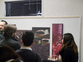
The name of the project - YUE 2012, yue means "the moon" in Mandarin Chinese and 2012 is the year when the event takes place.
The mission statement of this project is to reintroduce the traditional Mid Autumn Festival to the world by capturing the illuminated beauty of it with the state-of-the-art technology and having a fun gathering experience.
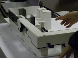
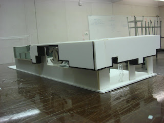
The concept of the design is inspired by the curves of the mooncakes that unite people together.
The exhibit will last for three weekends. Since the day of the festival is on 9/30 which is the last sunday of September, the exhibit will start on 9/14, the friday of three weeks before the festival.
Floor Plan
Entry / Greeting
Groups of lanterns along the entry guide the way into the exhibit, someone from behind a reception counter made of a big lantern greets the guests
Retail / Storage
A acrylic wall divides the public and the exhibit by having a big signage and storing different kinds of mooncakes for sale and storage
Big Lantern Riddles
Guests can walk into this tall translucent structure shaped like a lantern and covered with fabric to walk through and read the riddles hanging from the small lanterns inside
Communal Tables
In a curvy shape that tights guests together, they can enjoy food while chatting with family and friends from different directions
Projection
The projection screens cover the whole exhibit, information such as history, traditions, stories, food will be projected, guests can just look up to see the projections when they are enjoying their time at the communal table
Lantern Garden
A garden themed show that displays many different kinds of lanterns which allows guests to walk through and enjoy the lanterns
Wall Section Details
Takeaways + Event Calendars
Promotional Poster
Final Presentation
Final Model
I hope you enjoyed! =)
Read more...
Tuesday, December 28, 2010
Wednesday, September 1, 2010
Chanel Hotel Guest Room
Hi everyone! 3rd term has already come to an end! It was very fun and for my final, I had to design a hotel guest room for my Chanel hotel which was very exciting!
The concept for the room is the same as the hotel lobby, that is, to connect all the elements together conveying the brand's unique personality that all the products are packaged similar to each other.
Here goes the floor plans...
Living space - it is one step higher which is to show hierarchy, it has built-in furniture pieces which connect to the wall which is covered with the Chanel leather to show a more welcoming feeling
Workspace - has a built-in desk which comes down from the wall with shelves also covered with the famous Chanel leather pattern
Stairs to Bed - hierarchy to convey that the bed is the most important element in the room
Bed - it is designed in a rectangular shape with leather covered on the back wall and is shaped in a royal way which is inspired by the French kings
Window - it is huge which gives a contemporary feeling
TV - it is built-in to the wall and has a gap below that is painted gold which is to show depth and contrast
Closet - it is extended from the TV wall and it is made of glass to connect the interior of the closet to the whole room
Bathroom - it is connected to the closet and it is the only space in the room that has an entrance but without a door
Product Display - it is on the side wall of the bathroom
Side Wall - it is extended from the product display wall, it has angled shaped patterns to give off the design of the room
Crisp Lighting - a crisp white line shining on the floor guides you to the room and it also warns you of the step of the living space, it implies the clean and tidy feeling of the room as well
Indirect Lighting - to give warm and welcoming feeling
Indirect Lighting - the angled path has glowing yellow lights which lead you into the room
Section Perspective - Left Side
Section Perspective - Right Side
Entrance
Physical Model - Lit
Final Presentation Board
Hope you enjoyed! =)
Read more...
Wednesday, July 7, 2010
Env3 Midterm Summer '10
For my Environmental design 3 class, my project is to design a hotel for a brand.
I chose Chanel because the site is located in a high quality residential area, and Chanel is a very powerful brand in the fashion industry, therefore it would be perfect for the project.
I basically have to design only the lobby area of the hotel, but it needs to include a retail space, lobby or check-in area, a restaurant, a bar and elevators. The total size for me to design is 3,500 squared feet in a 15,700 squared feet ground level.
I researched about the brand and found out that most of its products are designed in a very similar way, either in the shape or in the color.
Not only the products, but Chanel retail stores are also designed in order to represent the brand clearly. All the Chanel stores are in rectangles but each of them looks very different from each other.
The demographics that the hotel is targeting is successful and confident women who desire to own luxurious products.
Hotel De Luxe Chanel is a boutique hotel that is co-branded with the high end fashion brand Chanel, taking the brand's unique personality that all the products are designed very similar to each other, the hotel is a space which all its elements communicate and are open to each other.
Entry
Retail
Check-in
Lounge Bar
Here are some pictures of midterm presentation :)
:)
Read more...
Subscribe to:
Posts (Atom)